Creating a Capsule Wardrobe Color Palette: 5 Methods
Curious about capsule wardrobes, but you don’t want to give up color? Or do you already have a capsule wardrobe and you’re getting bored with all the neutrals. In this video, I’m going to give you 5 ways to create capsule color palettes that show off your personal style and are anything but boring.
One of the main objections I hear over and over again about minimalist wardrobes is that they’re too boring or they all look the same. I get it. When I was first getting capsule curious, I thought the same thing—every capsule wardrobe I came across seemed to be black and white and gray, with maybe a stripe or a beige to mix it up. I even edited down my wardrobe to just neutrals (but I added navy ‘cause I’m crazy like that).
What ended up happening, though, was I started to get bored, and then I’d “cheat” by slowly adding more color into my wardrobe, and eventually it wasn’t so limited anymore.
A limited wardrobe doesn’t need to equal neutral.
Now, my capsules are full of color and so are my client’s wardrobes! The trick is to use color strategically, so that you still get all the mixing and matching benefits of a capsule plus the fun of color and showing off your unique personal style.
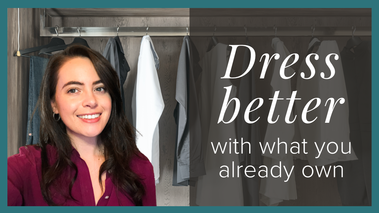
If you’re new here, I’m Missy of Simplified Wardrobe, an Ethical Personal Stylist & Capsule Wardrobe Curator. I help ambitious and eco-conscious womxn who want to look great, feel confident, and simplify their lives.
Find more information about personal style, capsule wardrobes, and color analysis over on Instagram. You can also download my free 10-page Guide to Defining your Personal Style.
Here are 5 Strategies to choose your capsule color palette:
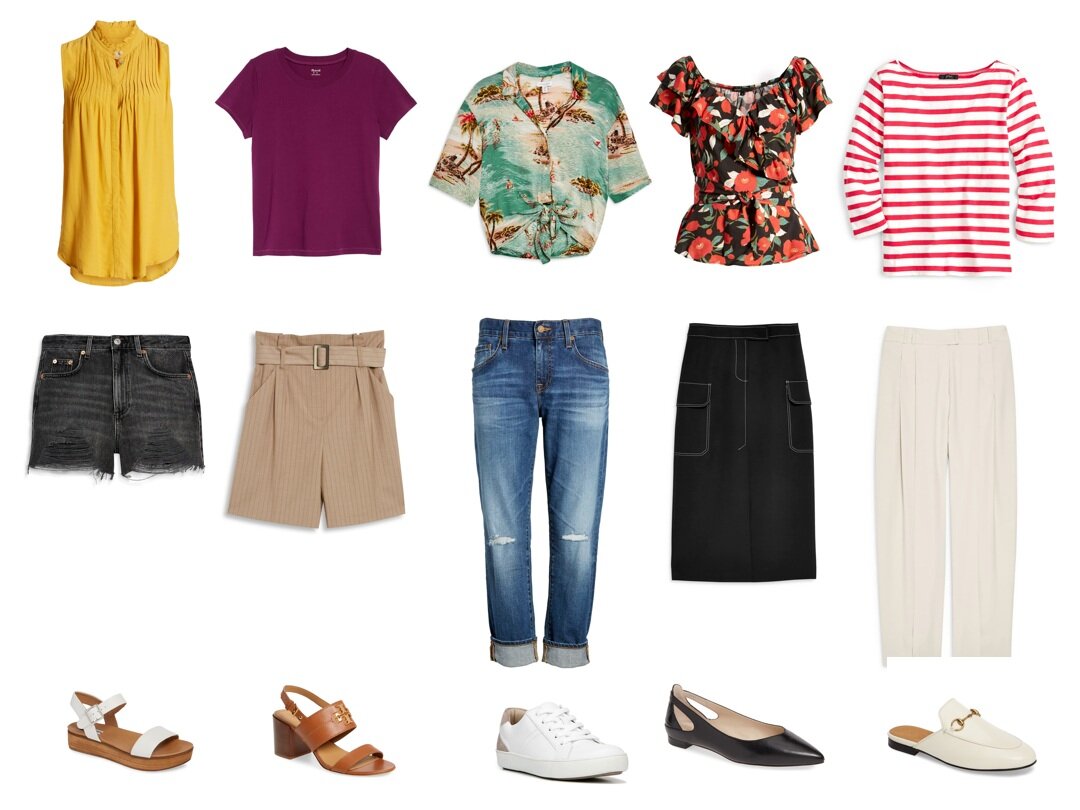
Strategy #1: Stick to one area of your capsule
This is basically color palette easy mode. What I mean is that you can choose either tops or bottoms and go color crazy as long as you keep the other category neutral. That’s because you aren’t going to wear two blouses or two pairs of pants at the same time, so those colors don’t really need to go together as long as they both go with most or all of your bottoms or tops, respectively. This also means any dresses or jumpsuits can be colorful, but you want to keep layering pieces and shoes on the neutral side. If you do opt for some color there, make sure they’re colors that go well with all the colors you’ve chosen in your colorful category.

Strategy #2: Find a Color Palette you like and copy it
You can use Pinterest to literally search “color palette” or “fashion color palette” to find hundreds of beautiful color palette examples. If you really like a certain color, like red for example, you can search “color palettes with red” and get a ton of palettes to scroll through until you find something you like and can see yourself wearing.
Another way to do this is to find a pattern in your closet or around your home that you love and pick out the colors from that. This works really well if you use that item of clothing in your capsule because you know you’ll be able to match them with something.
Strategy #3: Use what you have
Unless you’ve already totally detoxed all of your clothes, most of us have color in our wardrobes. In fact, one of the main problems I see in my clients’ closets is way too many colors and patterns. However, when I ask them to choose their favorites and their most worn items, some patterns start to emerge. I suggest picking out your favorite 5-10 items and analyzing what colors they are. Then pick out the 5-10 items you wear the most. (These might be the same items, but often they aren’t.) Analyze what colors you wear the most and which colors you say are your favorite. You might already have a cohesive color palette just with the items you already own and love. To go one step further, pull out your least favorite and least worn items as well just to see if you can spot any obvious patterns, like you only wear pastels or warm colors.

Strategy #4: Choose complimentary, analogous, or monochromatic colors
Alright, now we’re on advanced mode. Here’s some quick color theory. You’ve probably seen a color wheel before. It represents all the spectrum of pure colors. Here are 3 ways to use the color wheel to find cohesive color palettes:
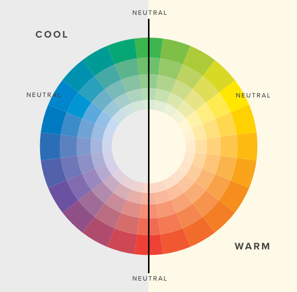
Complimentary Colors. That means colors that are opposites on the color wheel, like blue and orange or yellow and violet. Now, you don’t need to use the pure hue. You can choose a tint which is a lightened version or a pastel, a shade which is a darkened version like burgundy or navy, or a tone which is a muted version like a mauve or an olive green.
Analogous Colors. These are colors that are next to each, like red, orange, and yellow or green, teal, and blue. Again, you can soften the colors by making them lighter, darker, or more muted.
Monochromatic. This means you just choose one color and a few different versions of that color. For example, if you chose red, you could also add pink, which is a tint of red, and burgundy which is a shade of red, and even a cranberry which is a tone of red. I wrote a blog post about pulling off monotone looks if you’re interested in this method.
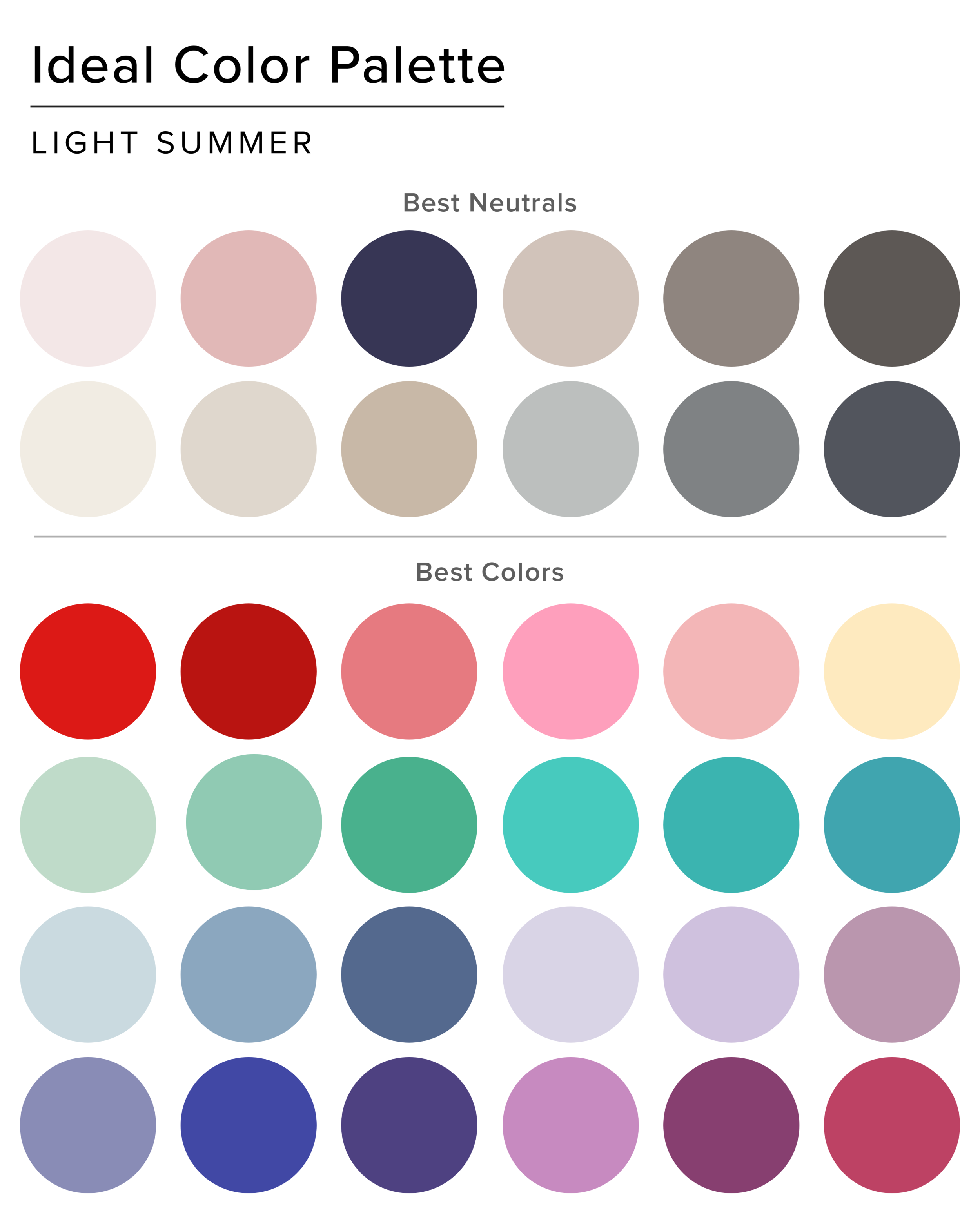
Strategy #5: Know your Color Type
This strategy is more involved up front but once you know your colors, matching colors will always be easy because all of the colors of your color type look good together. There’s literally no guessing at all, you can wear any color with any other color and not only will those colors look amazing together, but you’ll glow in those colors.
If you want to know more about your best colors, you can find out more information on getting your colors done professionally. I’ve also written a 2-part series on finding your best colors, starting with this blog post on determining your undertone.


If you’ve ever stood in front of multiple options feeling unable to make a decision, you’re familiar with decision fatigue. Here are 5 ways you can help prevent or reduce decision fatigue in your life so that you can make choices more efficiently that are in line with your values.