Beyond Undertone: Determine your Depth, Chroma, and Contrast to Find your Best Colors
In Part 1 of this 2-part Color Analysis series, you learned how to determine your undertone (and what is the difference between undertone and overtone.) At this point, you should know which hues look best on you: cool, warm, or neutrals. If you didn’t do this yet, stop. Go back to Part 1 and figure out your undertone.
Your best colors aren’t just cool or warm (though that’s important)—you also need to know the depth, saturation (or chroma), and contrast of your face to know how to put colors together.
(PS: If you struggled to find your undertone, it’s possible that what was actually throwing you off was contrast, depth, or chroma.)
If you’re new here, I’m Missy of Simplified Wardrobe, an Ethical Personal Stylist & Capsule Wardrobe Curator. I help ambitious, eco-conscious womxn who want to look great, feel confident, and simplify their lives.
Find more information about personal style, capsule wardrobes, and color analysis over on Instagram. You can also download my free 10-page Guide to Defining your Personal Style.
Value
Gradient of black to white separated into light, medium, and deep.
First things first, to understand depth or contrast, we first have to understand the value of colors. When we say value, we mean how much light is reflected off of the color; how light or deep it is. See the a graphic showing the gradation of value between black and white.
Rainbow colors desaturated to show their natural value.
Colors have value too, it can just be difficult to assess their value when all you can see is the hue (or the color). See the graphic showing colors of the rainbow desaturated to show their value. As you can see, yellow is naturally very light in value whereas indigo is very deep.
Depth
Depth simply refers to the overall value of your facial features: light, medium, or deep. Determining your depth is actually very easy and pretty black and white (pun intended—you’ll get that in a second). Take a photo of your face and desaturate it entirely (so it’s 100% grayscale, with no color at all.)
One thing to note: as a rule of thumb, your dominant features determine your depth.
Determining your Depth
Light
Overall lightness of hair, skin, and eyes. There’s nothing deep about any part of these faces.
Medium
Overall mid-tones in hair, skin, and eyes. There might be some light parts of the face, most features are medium in depth and there are no or few deep features.
Deep
Overall deep in hair, skin, and eyes OR dominant deep features. These faces might have very light or medium features, but there is either a lot of deep features or certain features (usually eyes and/or hair) is quite deep.
Putting it into practice
Graphic showing examples of light, medium, or deep colors.
When you determine your depth, you know how deep in value you can wear. People with overall light coloring, look best in lighter colors, like pastels. Whereas people with deep coloring can wear light, medium, and deep colors well.
See the graphic showing what that looks like in color.
Chroma
Chroma refers to the saturation of a color, whether it is the full, bright color or a desaturated version. Desaturating a color makes it more neutral because you’re mixing it with one of 3 neutral colors: black, white, or gray.
There are 3 ways to bring down the intensity of a color: shade, tint, or tone.
Graphic showing the gradient of intensity of colors from low to high saturation by adding black, gray, or white.
Shade—added black. This is a darkening (or deepening) of the color.
Tone—added gray. This keeps the color at the same general value but muddies it so it's not so bright.
Tint—added white. This is a lightening of the color (creating a pastel.)
See the intensity scale graphic from low to high chroma.
Determining Chroma
To determine your level of intensity, or chroma, take the same selfie, but this time, don't desaturate it. Observe whether or not your face and hair are full of color or more muted.
Low Chroma
These are examples of more neutral faces. See how their hair, skin, and eyes have a desaturated quality, like the colors were toned, tinted, or muted.
High Chroma
These are examples of high intensity, bright faces. See how their hair, skin, and eyes are more vibrant and full of color.
Putting it into practice
Knowing the level of chroma in your face will tell you whether or not you should skew toward neutrals or toward high-intensity colors. If you’re low chroma, you want to wear more muted colors. Ideally, added white if you’re light, added gray if you’re medium, and added black if you’re deep.
Contrast
Contrast is the level of difference in value between 2 or more different colors. In other words, it's how many "steps" away a color is on a gradient scale. For example, black and white are high contrast because they are as far as you can get on this scale, whereas 2 medium grays are low contrast because they are close on the gradient.
Graphic showing low, medium, and high contrast pairings, both light to dark and similar to contrasting colors.
You can also create contrast by using 2 colors on the opposite side of the color wheel—these are is called "complimentary colors." Therefor, colors close together on the wheel (also called analogous colors) are lower in contrast.) See graphic of low, medium, and high contrast color pairings.
Determining Your Contrast
To determine your contrast level, use the same desaturated photo you used to find your depth. To see how much contrast is naturally present in your face, you want to assign values to 4 elements of your face: hair, skin, eyes, and mouth. Assign each element a value of 1 (light), 2 (medium), or 3 (deep OR bright*).
*If your feature has high chroma, or brightness, count that as a 3. For example, really orange hair or bright blue eyes.
Once you’ve assigned a value to each element, use the guide below to determine your contrast:
Only 1s and 3s = High Contrast
An even mix of 1s and 2s OR 2s and 3s = Medium Contrast
A mix of 1s, 2s, and 3s = Medium Contrast
Mostly 1s OR 2s OR 3s = Low Contrast
High Contrast
You have a lot of contrast between your features.
A. Zoe Deschanel has fair skin (1), dark hair (3), and bright blue eyes (3), so she is high contrast.
B. Lupita Nyong'o has dark skin and hair (3s) but very white eyes and teeth (1s), so she is also high contrast.
C. Madeline Pesch has bright red hair (3), pale skin (1), and deep eyes (3), so she is also high contrast.
Medium Contrast
You have some contrast to your face.
A. Kate Middleton is overall light (1) and medium (2), giving her medium contrast.
B. Mindy Kaling is overall medium (2) and deep (3).
C. Nicole Kidman is overall fair (1) but has bright eyes and hair. Because no part of her is deep, the brightness of her hair and eyes gives medium contrast.
Low Contrast
You have very little contrast between the elements of your face.
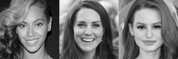
A, B, and C. Tilda Swinton is overall light, Jeniffer Anniston and Beyonce are both overall Medium.
Note: I can't think of anyone with very dark skin who would be low contrast because the white of their eyes and teeth will always provide at least some level of contrast with their skin.
Putting it into practice
Once you've determined your level of contrast, you want to match the level of contrast in your clothing. If you are high contrast, you should wear clothing with high contrast, medium and medium, and so on.
See the graphic showing what that looks like in color.
Someone with very high contrast and cool coloring would look great in true black or bright magenta, but someone with low contrast and cool coloring would get totally washed out by those high intensity colors.
So if you were doing the undertone test and couldn’t decide between brown and black or white and cream, it’s possible that you were actually picking up on the fact that black and white were too harsh for your softer coloring. If you felt like gold was too bright for you, it’s possible that bright gold washes you out, but antique gold is in perfect harmony.
Rather than making you look ill like the wrong undertone, the wrong intensity or contrast of color overpowers you or washes you out—it’s important if you want people to see you (and not just what you’re wearing).
If the first thing someone notices about you is your shirt, that means it’s popping, and not in a good way. Instead of enhancing your beauty, it’s drawing the eye to whichever part of your body is wearing the color (which might not be a part of the body you particularly want attention drawn to.)
Wearing the right level of contrast will draw attention to what’s most important—you!
Still Need Help?
Using all of the tips above to analyze your natural coloring, you should be able to get a better sense of the colors that work best for you. However, if you find that you don’t have time or are getting stuck somewhere in the process and want to get the help of a professional eye, plus tons of tips on which metals you should wear, what hair colors look best, and what colors you should absolutely avoid, I do offer Virtual Color Analysis. You’ll get a 6-page PDF all about you and what colors, patterns, neutrals, color combinations, hair colors, jewelry, and more will make you shine.


If you’ve ever stood in front of multiple options feeling unable to make a decision, you’re familiar with decision fatigue. Here are 5 ways you can help prevent or reduce decision fatigue in your life so that you can make choices more efficiently that are in line with your values.